When creating an online shop, the first thing that might come to mind is; "How can I make my online shop stand out?"
In this article, we'll deep dive into what makes a great design.
Selecting the perfect design
When selecting a design for your online shop, you might be considering;
- It needs to match my brand colours
- It needs to use this font type
- It needs to support video
- It needs to have an online chat option
These are all good things to consider, however, that's not all. The perfect design provides a complete experience. So it's also important to consider;
- Is the design fast enough?
Are users able to find and buy products in the fastest way possible? - Does the design deliver the brand experience?
If a client comes in the store, do they have the same experience online?
Apart from that, we have to keep in mind that there are millions of online stores. Unlike a local store that might compete with a handful of other stores in the area, an online store is competing with hundreds of thousands of stores. So the design of the online store should also be;
- Mobile optimised
Does the mobile version of the design provide a unique buying experience? - SEO optimised
Does the design make it easy for Google to find the online shop, and rank the online shop?
Experiment, Experiment, and Experiment some more
At Lifeboat, we understand when you first launch your online store, you might not get it just right the first time. This is why we provide an ever-growing library of designs. You can switch your design at any time for free.
So don't be shy to experiment, try a few designs, get feedback from your peers, get feedback from your customers.
Start big, end small
In the first few weeks and months of launching an online store, it is normal and acceptable, to completely change the design of your store. However, as your store starts gaining traction with your audience, the changes should be smaller, and smaller with every iteration.
This is important because every time you change your design a few things are happening;
- Your existing audience is confused
If regular customers see a new design every time they log in to your site, they will have to re-familiarise themselves with the brand. - Google will have to re-index your site
Google and other search engines might feel that a new design means a complete business change so, they will have to re-validate everything. Which will drastically hurt your rankings.
So always keep in mind that it's ok to change the design completely in the early days of your online shop, but make smaller and smaller changes as you go along.
Data is your friend, but intuition is key
When changing the design of your store, you can monitor how users are interacting with your design. It's easy with tools such as Google Analytics. You can enable Google Analytics tracking by following this guide: How to connect Google Analytics to Lifeboat.
But focusing solely on data might be very misleading. Let's take an example;
Scenario 1: The new design increased engagement by 30%, but sales decreased slightly.
Scenario 2: The new design decreased engagement by 15% but slightly increased sales.
- A digital marketer might say; "Scenario 1 is far better because more engagement time means we'll get better ranking on Google".
- A UX/UI person might say; "Scenario 2 is better because users are getting the job done faster"
- A salesperson might say; "Scenario 2 is better because we're getting more sales"
But in reality, all the above statements are somewhat wrong because they are based on assumptions. When experimenting with a new design, the data should only validate your assumptions. But never build assumptions of the data. So let's change our approach;
I want users to spend more time on my online shop
Then scenario 1 is working great, the data proves that the changes done are producing the desired results.
I want to increase sales
Then scenario 2 is perfect, data proves that the changes did are working.
Finally, validate the data. If your goal was to increase time on page, scenario 1 proves that is working. But is time on page increasing for the right reasons? Are users happy to be on your site longer, or is it simply because it's harder to find what they are looking for? The best way to test this is by asking family and friends to test the buying experience.
The goldilocks zone
You know that you have the perfect design when;
- The data aligns with your goals
- Your test group agrees with your goals
- Your customers have a delightful experience
- The data confirms your customers have a delightful experience
Examples of great E-commerce designs
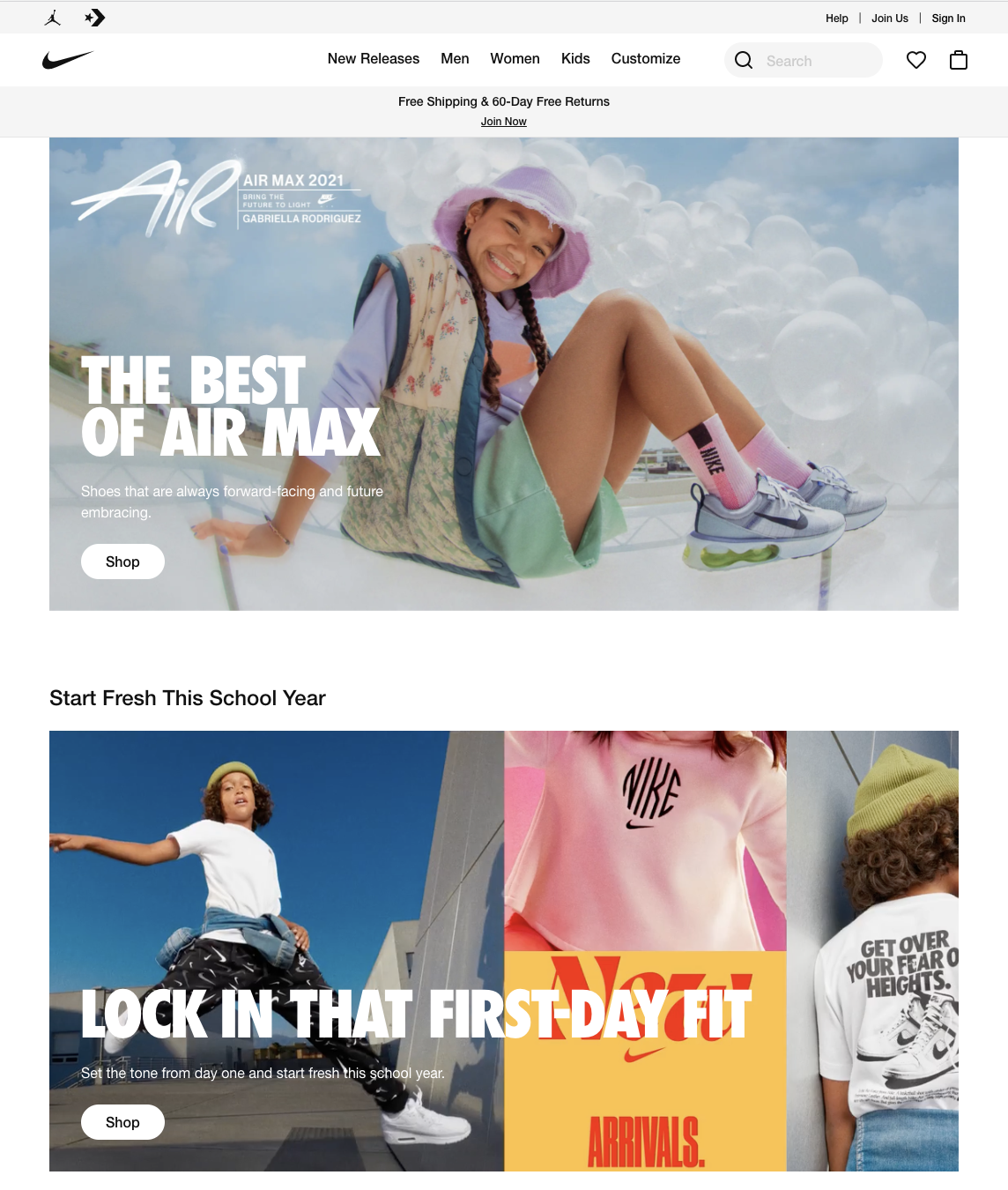
nike.com

The first thing we see when opening the nike.com website is its simplicity. There aren't many moving parts, just a plain black and white theme with the focus being the products. The images of the products also deliver on the brand message; "We are a lifestyle brand, we have the perfect fit apparel for anyone." On the technical side, it's also blazing fast which helps Nike to rank well on Google. It's also relatively easy to find a product with an easy to use search. The site also asks the users to confirm their location to deliver a more personalised experience. All-in-all when visiting the nike.com online shop, I feel as if I'm visiting one of their stores.
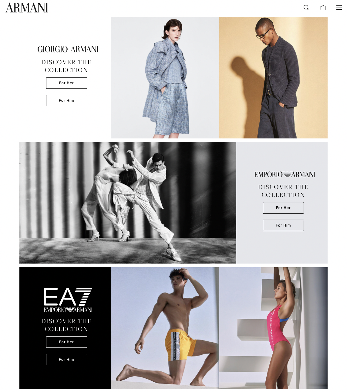
armani.com

This design is not the most welcoming at first with various popups. However, the more you spend time on it, the more you get to enjoy it. This is exactly what the Armani brand is all about; "It's an acquired taste. It's a statement". Again, thus reinforcing the brand and its values.
The more technical side of a design
Yes, a design needs to be fast however, in the online world the term design is inter-changed with "theme". A theme is a technical term to describe; How a design is turned into code which the device can read and render. So we can't talk design without addressing a few aspects of a theme. The big game-changer in theme came in when Google introduced "Microdata", a bit of extra code on your website that helps Google better showcase your site.
Why does this matter?
If you're using a platform such as Lifeboat, this Microdata is automatically added for you. It allows Google to understand what reviews customers have given to a product, what is the price of a product, etc... At the time of writing this article (2021), this plays a big role in online commerce. Because Google can better understand your site, it will be inclined to show more information such as; Star rating, contact number, reviews, pricing etc... All of this amounts to a much better Click-through-rate (the number of people that click through your website, after seeing it on Google). So when selecting and refining your perfect design keep in mind that the theme rendering it is equally important to help your business grow online.
Changing the design in Lifeboat
You know how to choose and refine the perfect design, but now how do you take this knowledge and put it into action? With Lifeboat, we've constantly evolving to help you get to the perfect design.
Installing a new Design
- Visit Lifeboat Admin > Design
- Click on Install Theme
- Select the design you like from the provided list
Tip: All themes come with a preview link, click it to have an idea of how your store will look like - Click on Install
- The design will be added to your library, you can;
- Click Customise to refine the design
- Click Preview to see how your site will look like
- Click Actions > Make Default to set as your primary theme
BONUS
You can also preview how a certain design might look like by visiting our online shop examples page.
Customising your design
If you're happy with your current design, but want to make small adjustments;
- Visit Lifeboat Admin > Design
- Click on Customise
- Make the changes you require
- Click Save
Conclusion
In this article we've gone over; What makes a perfect design, how to test and validate, and how to implement such changes in Lifeboat.


