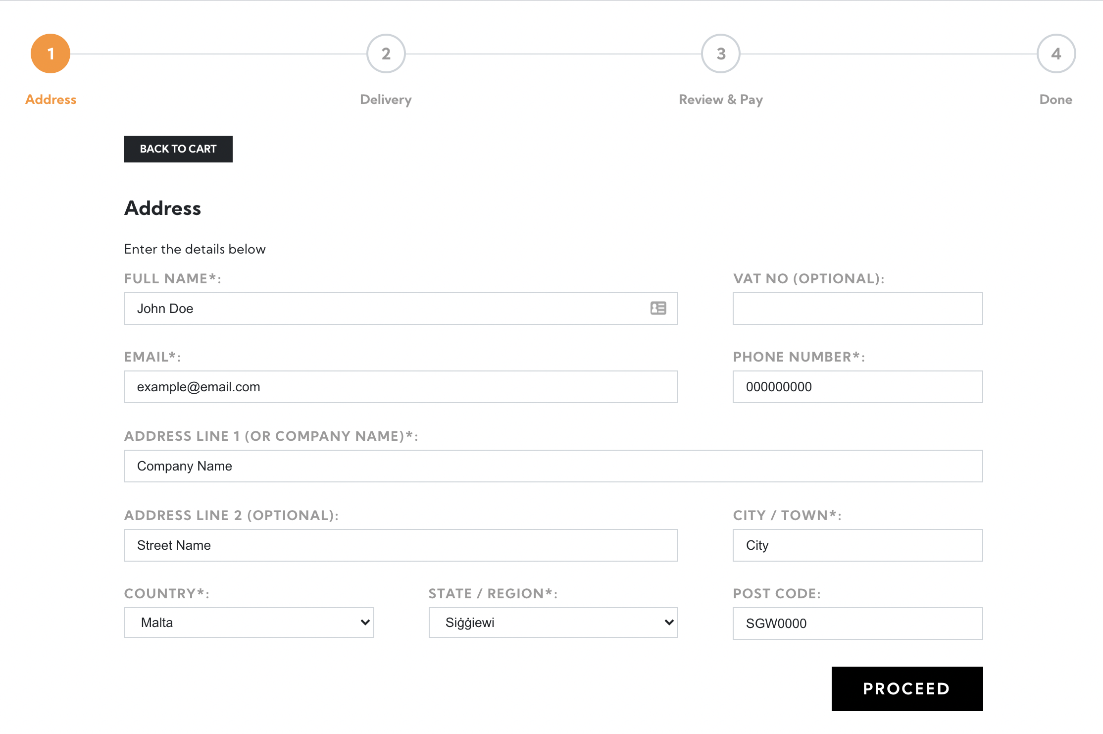
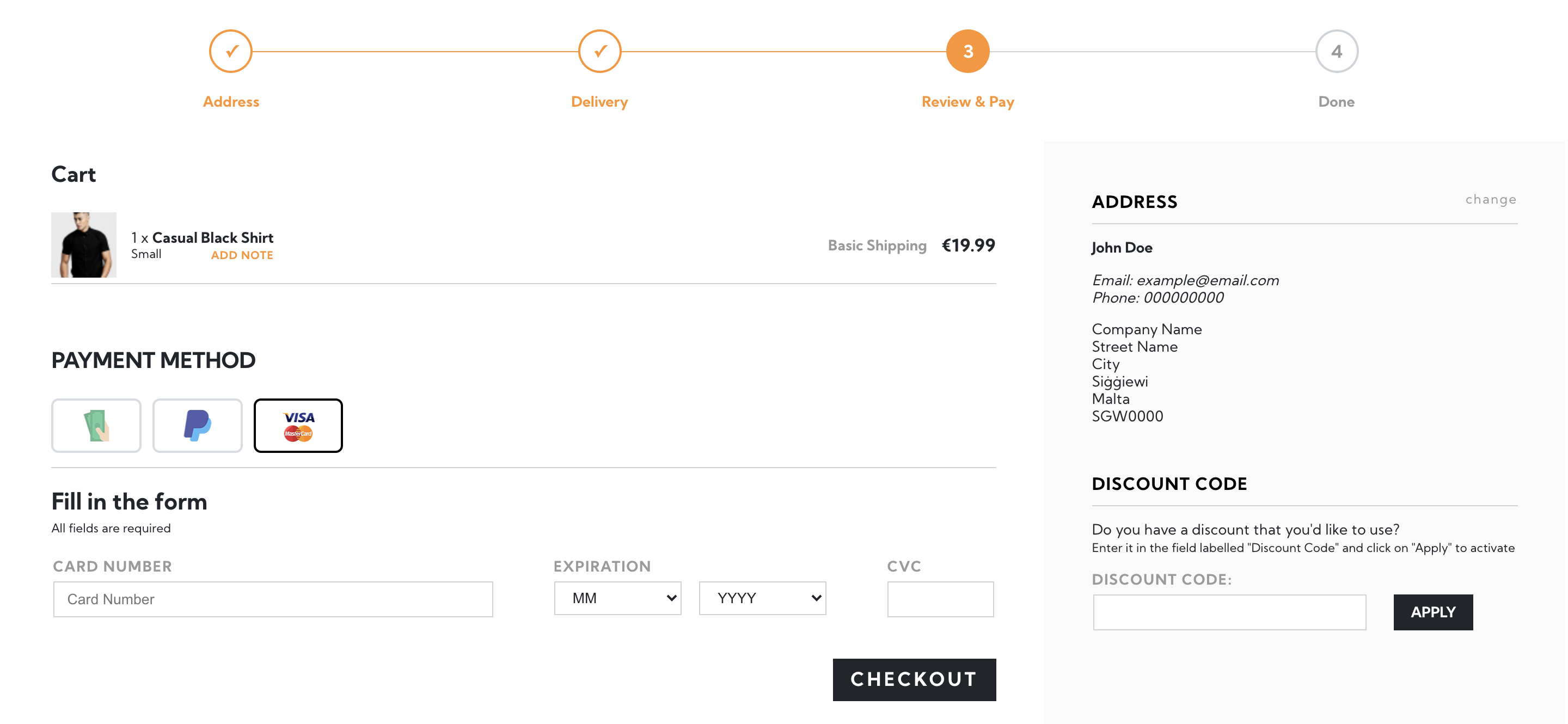
Lifeboat checkout was always very well regarded but it lacked the modern flare. We knew we could make it better, faster, and easier to use. With the goal set, we went on to prototype a few ideas until decided on the improvements we were going to make.
It had to be beautiful
We've tasked our designers to come up with something sleek, modern, and it had to be as easy to use as possible. The designers came around with a few options, but the key elements were apparent from the first version. We had to;
- Reduce the number of colours
- Reduce distractions
- Include a progress indicator
The end result speaks for itself;

It had to be faster
Checkout is probably one of the hardest parts to optimise for performance because of the amount checks it needs to perform to ensure a safe and verified transaction. However, our dev team took on the challenge at heart and started looking at all the parts of the checkout process, from the front-end code to the database queries it needed to perform. After a long review process, a set of requirements were put forward;
- Checkout pages had to be 100% non-blocking
- Server response had to be under 1 second
- Checkout pages had to stop using third-party libraries
Once the process was done, it really showed the sheer determination to make all of this happen, and again, the results speak for themselves;
Average Page Load Time: 400ms (0.4 seconds)
Average Request Size: 180kb (including product images)

Putting it all together
Once all the technical requirements had been met, and the design team was ready with its final version, it was time to put it all together. We're obviously biased, but we can't resist; "It looks amazing!". The minimal colours, seamless flow, blazing fast load times...

Conclusion
The checkout page of an e-commerce website is one of the most pages, that is why we wanted to improve it as much as possible. With that said, we hope you enjoy the updates, and if you have any comments don't forget to post them below or send them directly to our support team.


